27
Aug...
New Corporate Design
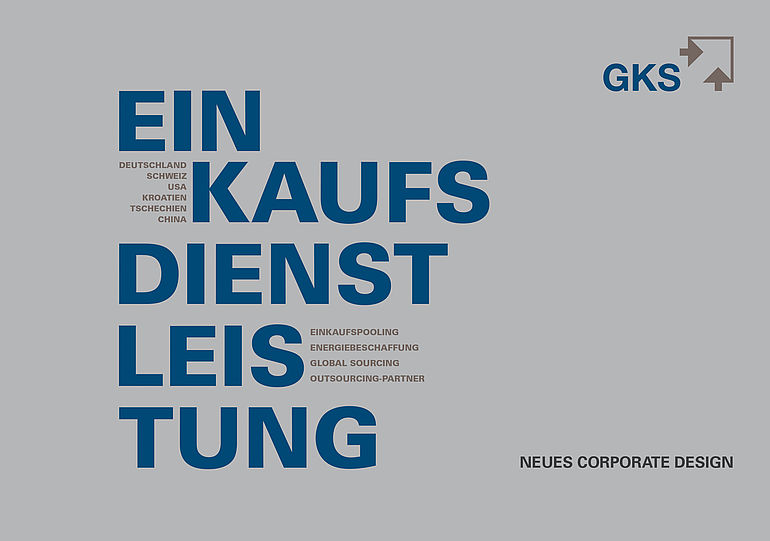
Cautious optimisation of the existing Corporate Design with regard to readability, print and modernity.
Important
Optimising of the previous Corporate Designs - Growth must not be put at risk.
Bottom line
A logo is more than just a sign. It is the very first impression of a company. Less sign, more GKS by weight transfer. The focus lies more on GKS. New colors for integrity, tradition, reliability ; the combination of the colors underline the elegance of the logo.